 They say that a dentist’s kids have the worst teeth and a carpenter’s house is never finished. Such is the case with my band’s website. Without getting too much into it, our band’s style has a rather amorphous genre (described as “Pearl Jam meets Bette Midler”), which our old site never quite communicated, and our old site still portrayed us as a full band despite having become an acoustic duo. What we needed was a major overhaul to the tone and visual aesthetic of the site and a few upgrades in UX.
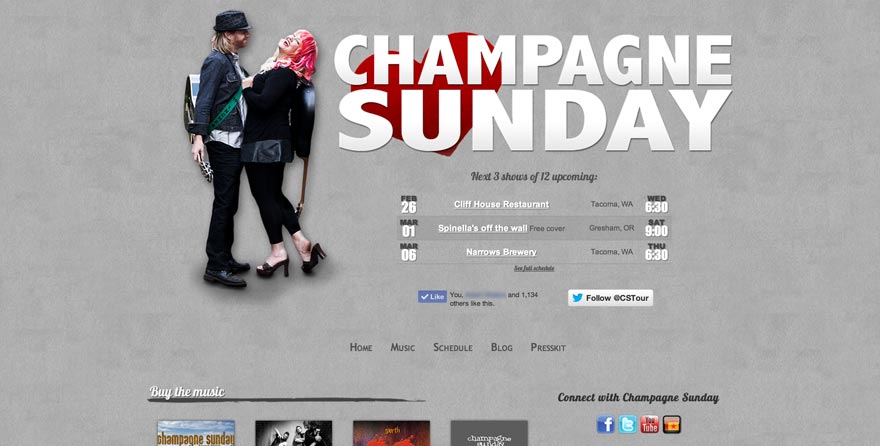
For starters, I wanted the home page to be an immediate go-to point for our most important information: Who we are, where we are playing, and how to connect via social network. Next to a photo of the two band members (my wife and I), and underneath a nice, big logo, I pulled the RSS feed from our ReverbNation schedule (updated via cron job to help speed up the page load), and displayed our next three shows very prominently. Beneath that, users can like us on facebook and follow us on Twitter.
Scrolling down, the home page also features our social networking icons, a random sampling of our music (via SoundCloud), links to buy or listen to our albums, a brief bio, a Twitter feed, latest blog post, and a random image gallery from our flickr page.
The Music page is a template that uses the PHP GET method to pull the appropriate data from an XML page to populate the page. Beyond that, our Schedule page is a very simple layout, and our Blog and Presskit pages link to our WordPress and ReverbNation pages, respectively.
While I’m happy with a few aspects of the page and feel that it is adequate for our current needs, I also see it as a largely unfinished quick fix which I have future plans to overhaul.