 When my band was in Portland on tour, we kept going to Crema because we loved their coffee and food. At the same time, I was in school. One of my class assignments was to create a website for an existing business. Whether or not we ever published it or presented it to the business was entirely up to us. Crema’s website was little more than a color scheme and an email address, so I figured this would be a great project, and possibly a good way to make some money on the road. The owner was very receptive to the idea, and I gave him a screaming deal since it was a student project.
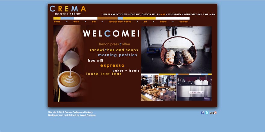
In retrospect, it’s technically not one of my better sites, but compared to what it was, I’m proud of it. Aesthetically, I was able to organize the content and keep the branding strong through the use of the blue “c” and the sort of block-y colored bars that are prevalent in their logo. Without much to go on image-wise, I had to work with pictures that I took myself. And I don’t fancy myself much of a photographer. After awhile, the owner was able to get me some more professional shots to add into the design where I could. It’s due for an overhaul and update, but the owner is satisfied with it for now.