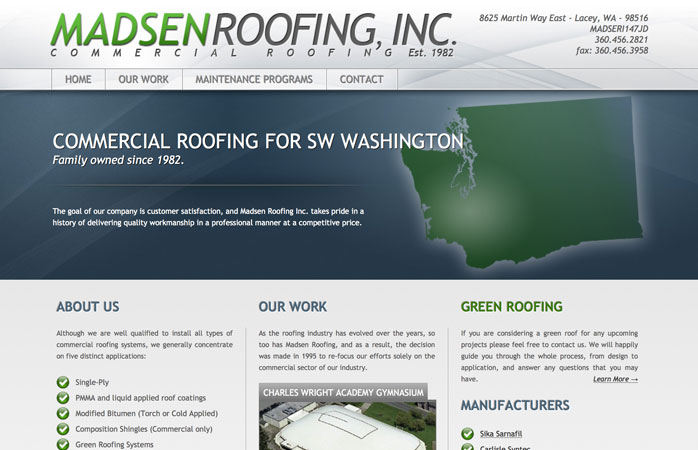
Madsen Roofing’s old website was becoming a hindrance to their business. First impressions matter, and while their reputation has always been solid, their website was not accurately reflecting their worth to their commercial roofing clients. They wanted a full overhaul of the look and function of their site, so I redesigned their company logo and created a simple, but more polished, more SEO-friendly and more effective site.
I began with a template as a starting point, and customized it according to the needs of the business. In order to keep a few of the details in line, I wrote some simple jQuery to make sure that the buttons at the bottom of the left and center columns would always line up, regardless of how much content was in either one. There’s nothing more irritating and visually off-putting than a design that ALMOST looks clean. I also added a scrolling image to the “Our Work” page that cycles through pictures of some of the company’s past jobs, using only HTML and CSS.


