Enhancing the Look of Your Website
Good websites need good graphics. That doesn’t necessarily mean that you need fine art on every page, but you do need to have graphics that enhance your message and look professional. For this, you’ll need someone that knows how to work with graphic editing software.
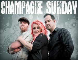
For the past fifteen years, I have been in charge of creating gig posters and promotional material for my band, Champagne Sunday. A lot of times, we’ll get publicity photos that are decent, but lack a bit of flair, so I’ve gotten very good at making the pretty good look stellar (see the example on the right). Between that, my bachelor’s degree, and the websites that I’ve created, I’ve had plenty of practice using Adobe Photoshop and Illustrator.
Combining my graphic design skills with my knowledge of website design, I’m able to create images and graphics that not only look great, but also load quickly and work well in conjunction with the other elements of the website.
When it comes to website graphics, more often than not, subtle changes can make a world of difference. In the case below, I was able to take a decent bio image and make it look more cohesive with the purpose of the site by digitally adding the company logo in the background on top of a few subtle enhancements.


