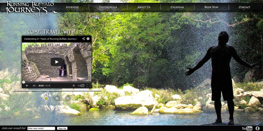
 The client came to me with oodles of content and big ideas, but only a hazy description of what they envisioned as the end product. They felt that the best way to sell their adventure tours was to bring the user as close to the destination as possible before they even signed up, so they wanted big, full-screen background images, lots of extensible image galleries, and not a lot of unnecessary text. As I threw out ideas, they threw ideas back. We fed off each others’ inspirations. Throughout the whole process I had to stay very fluid and flexible, as we both made a lot of progress through experimentation.
With the full screen background image, I knew that the page layout had to be fairly flexible, but I also wanted to use a static header and footer to keep a sort of proscenium viewing port for the content. Using jQuery, I was able to write code that spaced the main navigation links evenly across the page to keep the full-page feel no matter what size the browser window was. To contain the content, I used a fixed-width, flexible height, semi transparent wrapper box and made vertical overflow scrollable.
The biggest hurdle was the image galleries, featured in the journey descriptions and itineraries, where the user could click on a given word and scroll through a series of images (both via arrow keys or mouse clicks) that would appear in a lightbox. There could be anywhere from 1 – 12 images pertaining to the word that was clicked. The client wanted the user to be able to easily scroll through the gallery from beginning to end, starting with the corresponding gallery for the clicked word. This was all accomplished using PHP, XML, jQuery, and a strict naming convention for each of the images.
Due to the nature of the trips, e-commerce was not necessary at this point in the development of the business. However, they plan to add that functionality at a later date.

